PROJECT TASKS
Logo,
Branding,
Packaging
|
DESCRIPTION
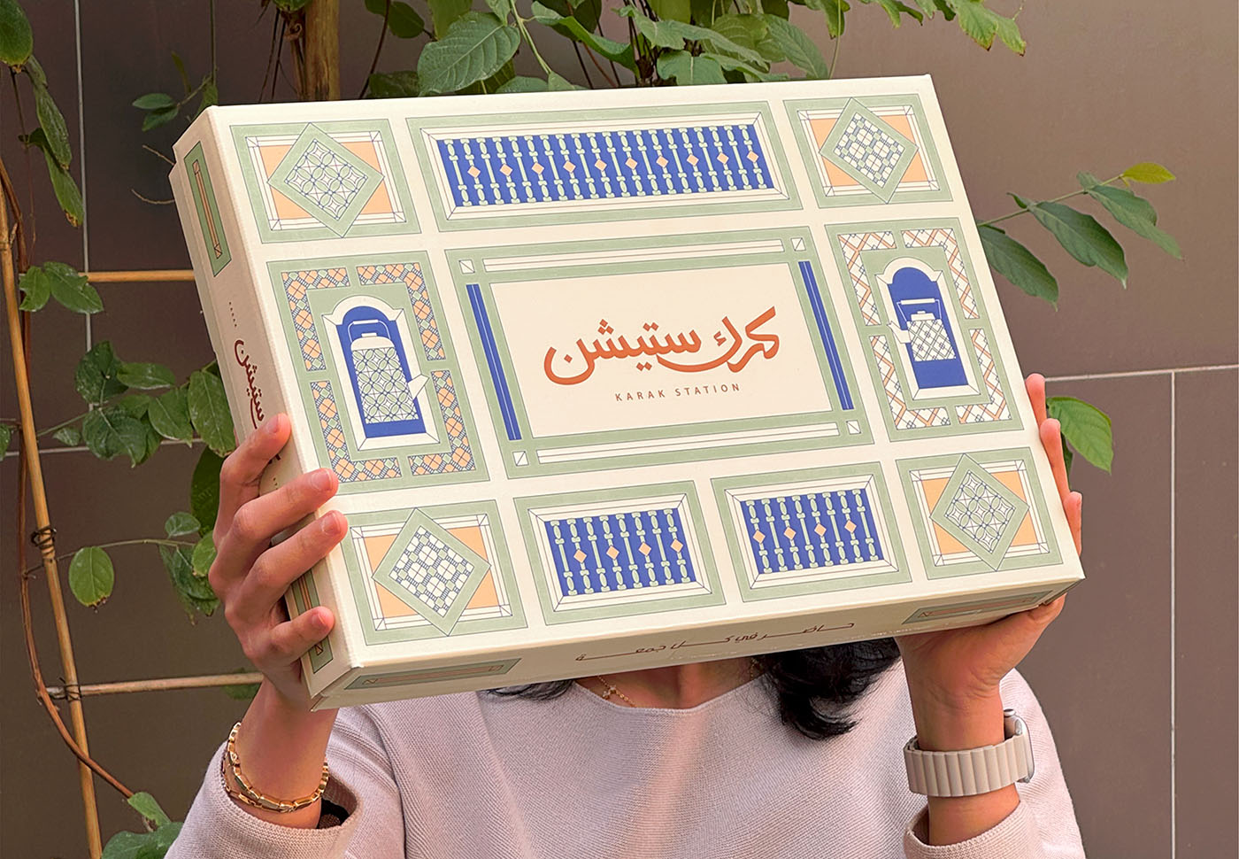
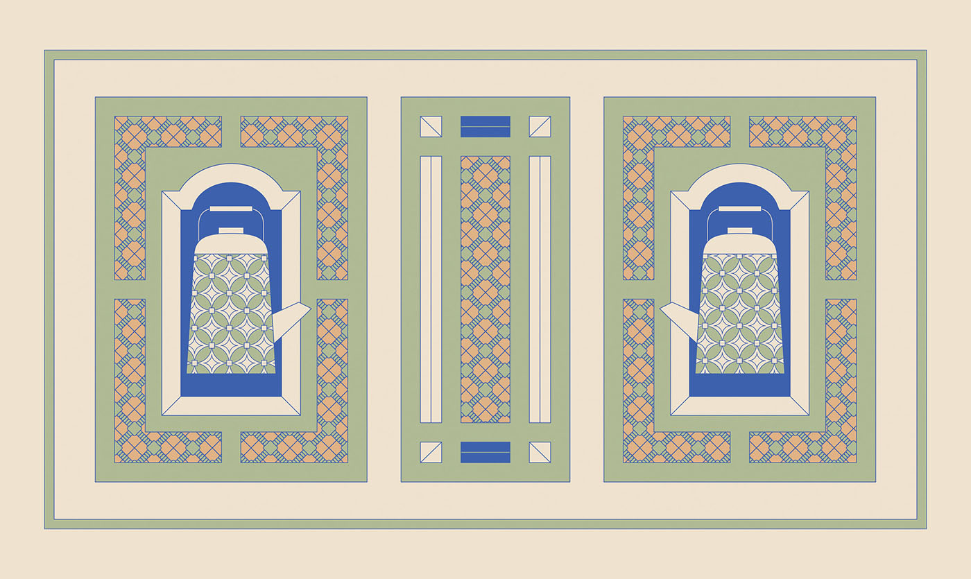
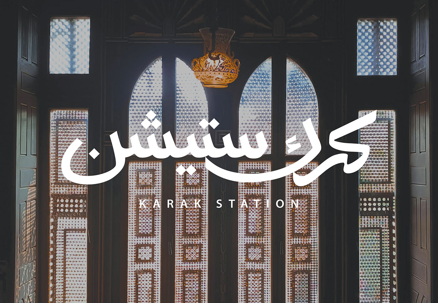
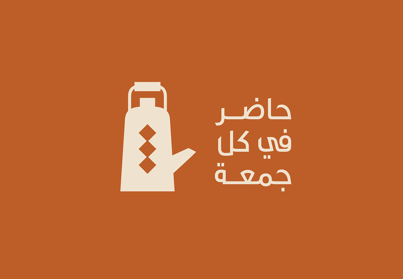
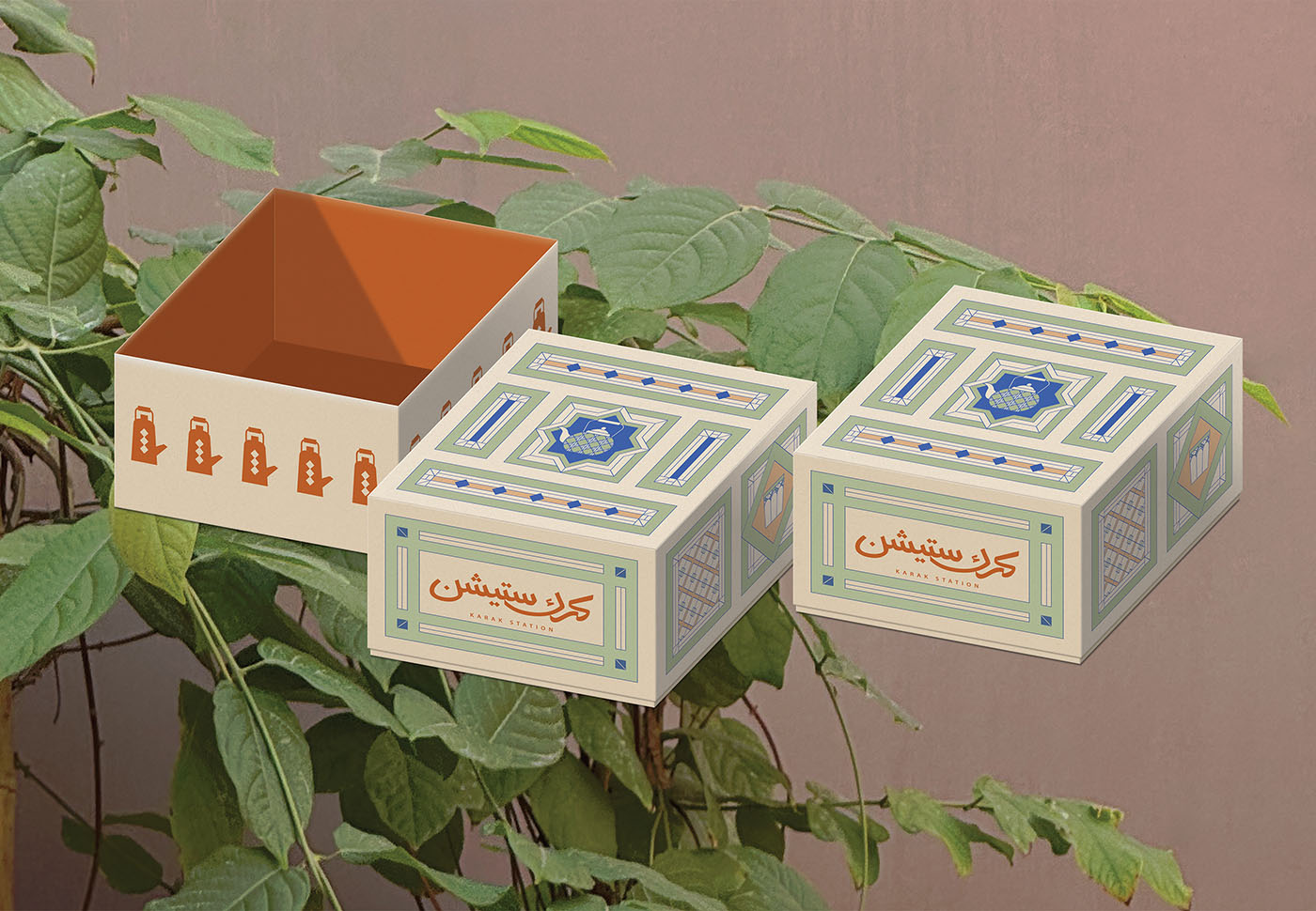
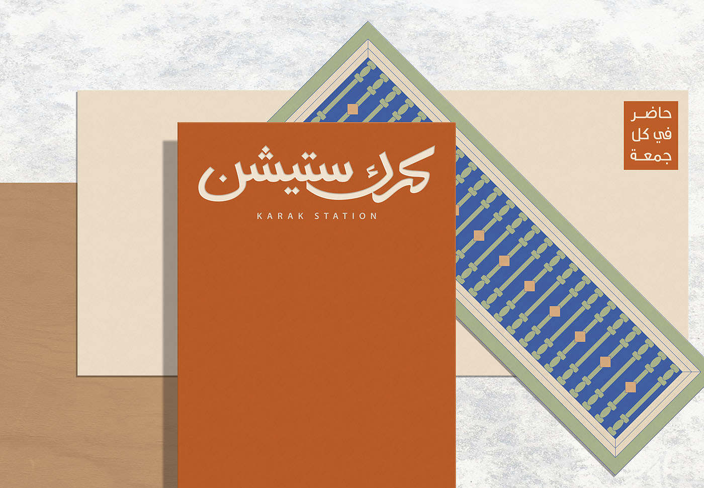
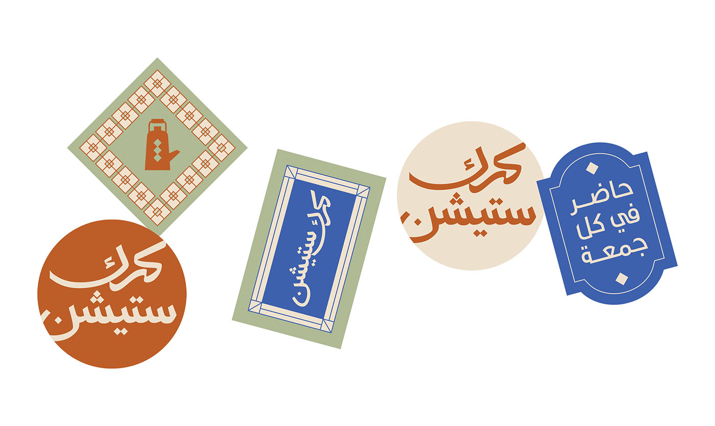
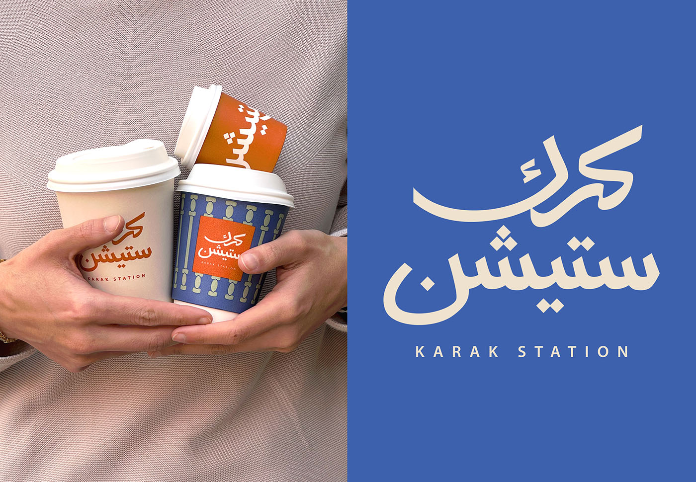
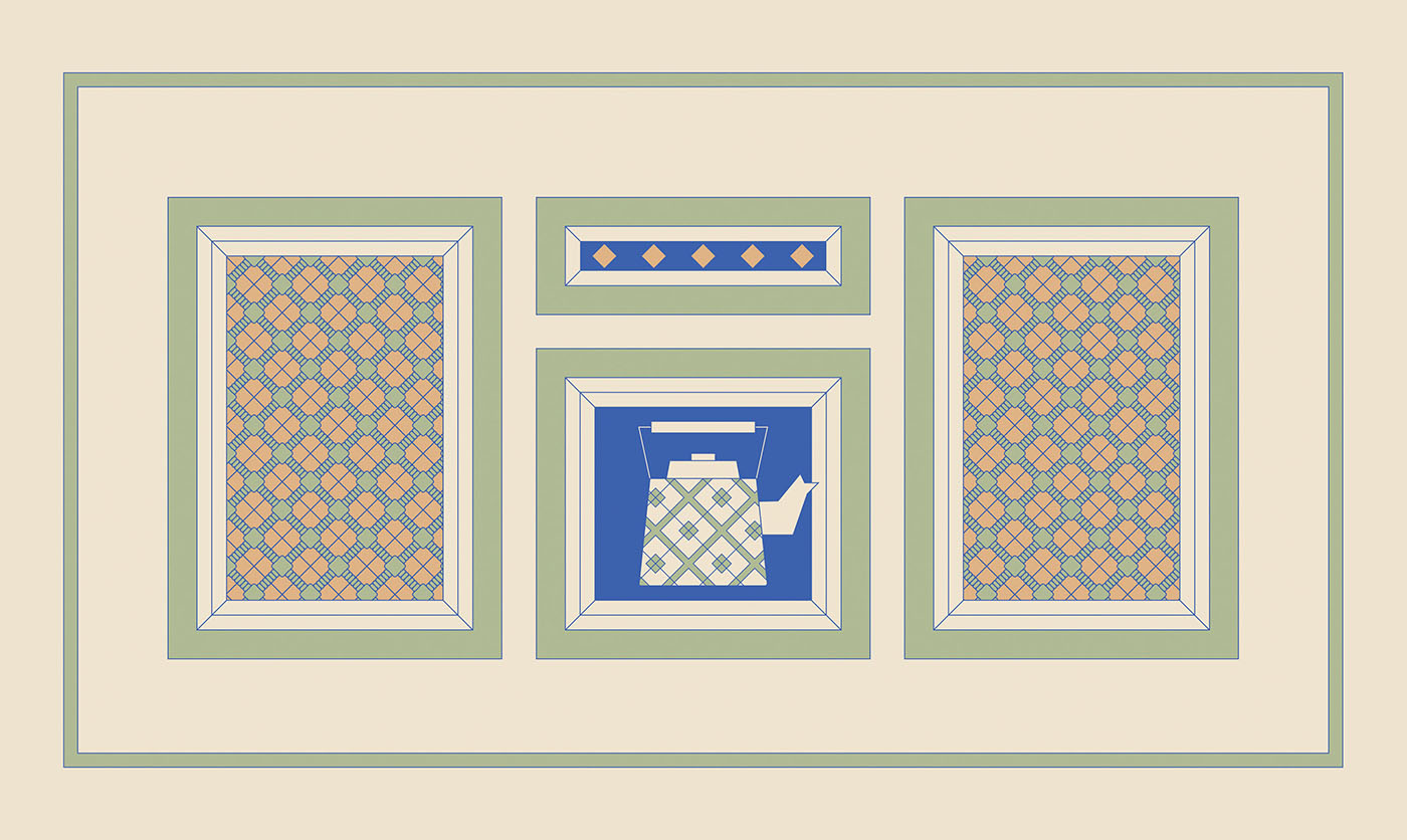
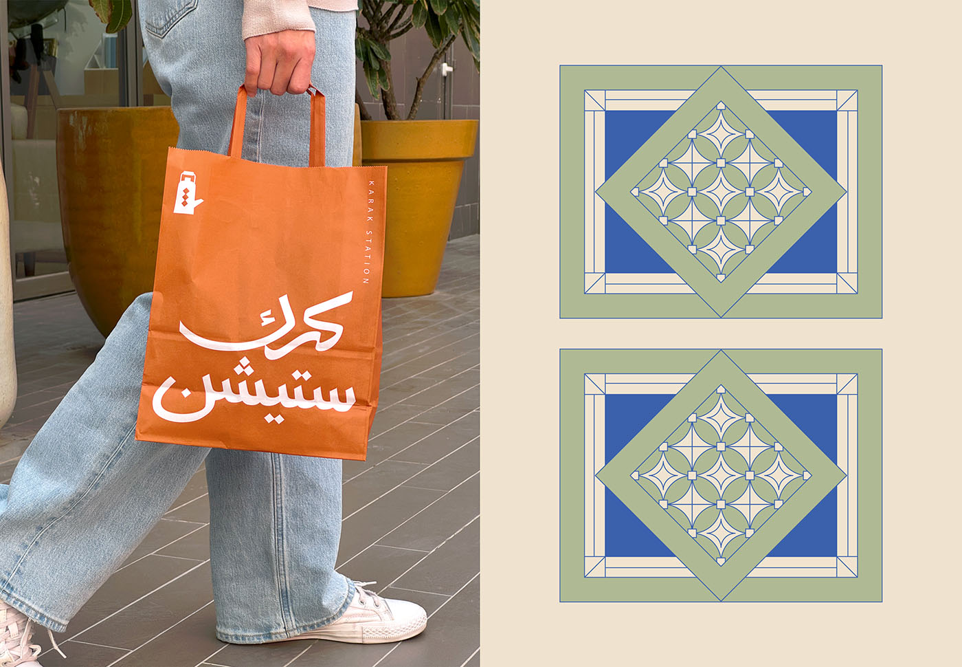
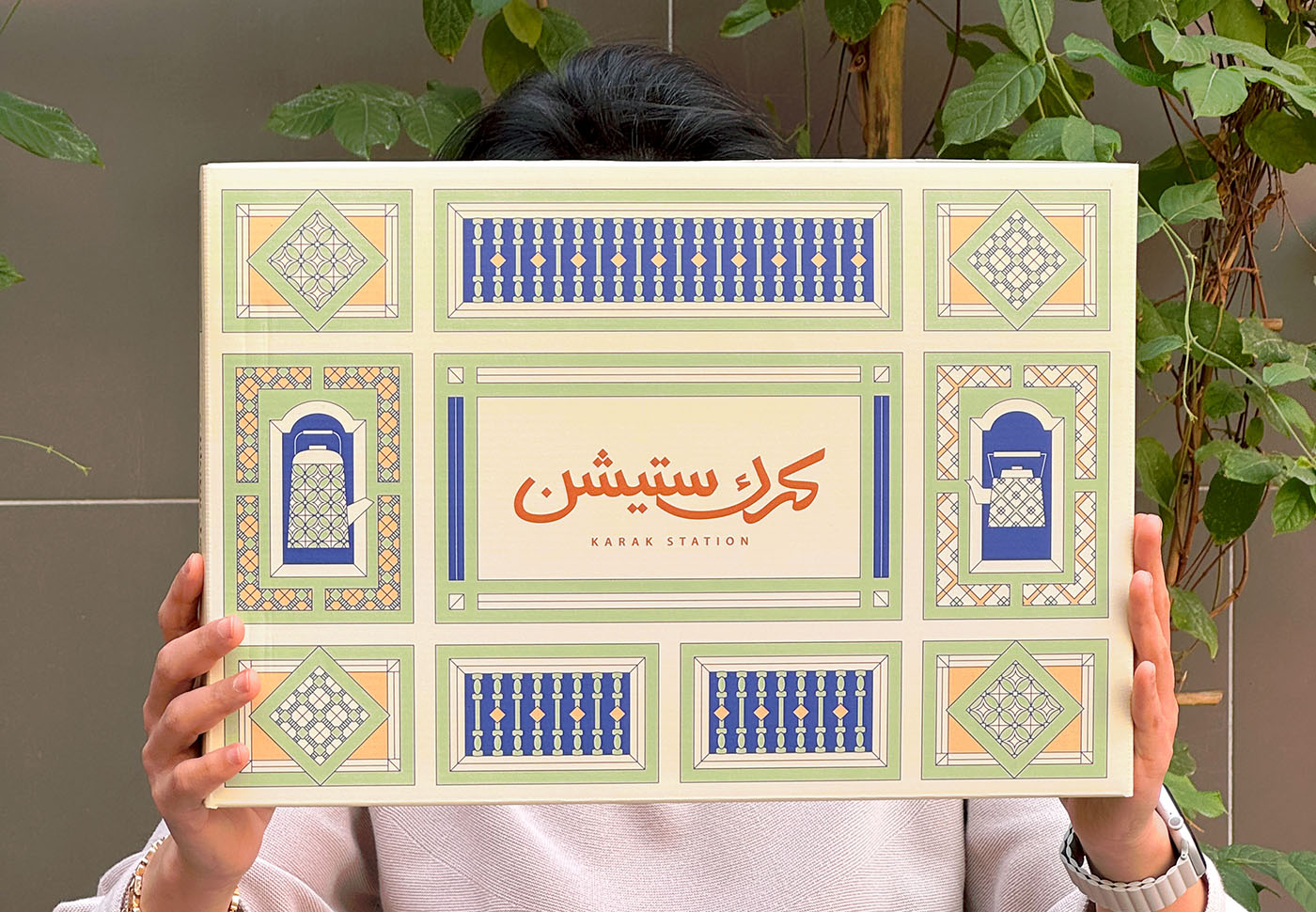
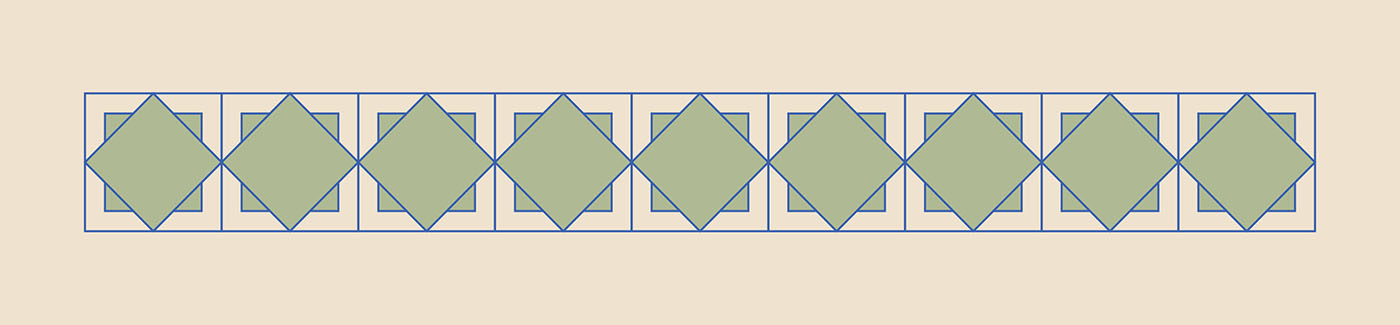
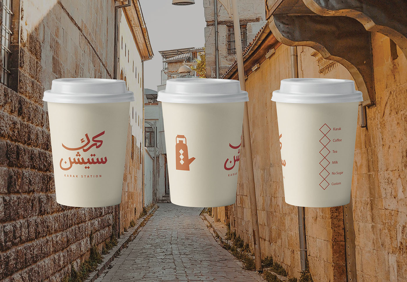
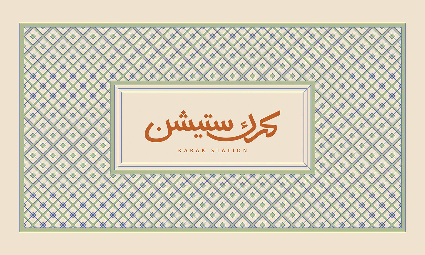
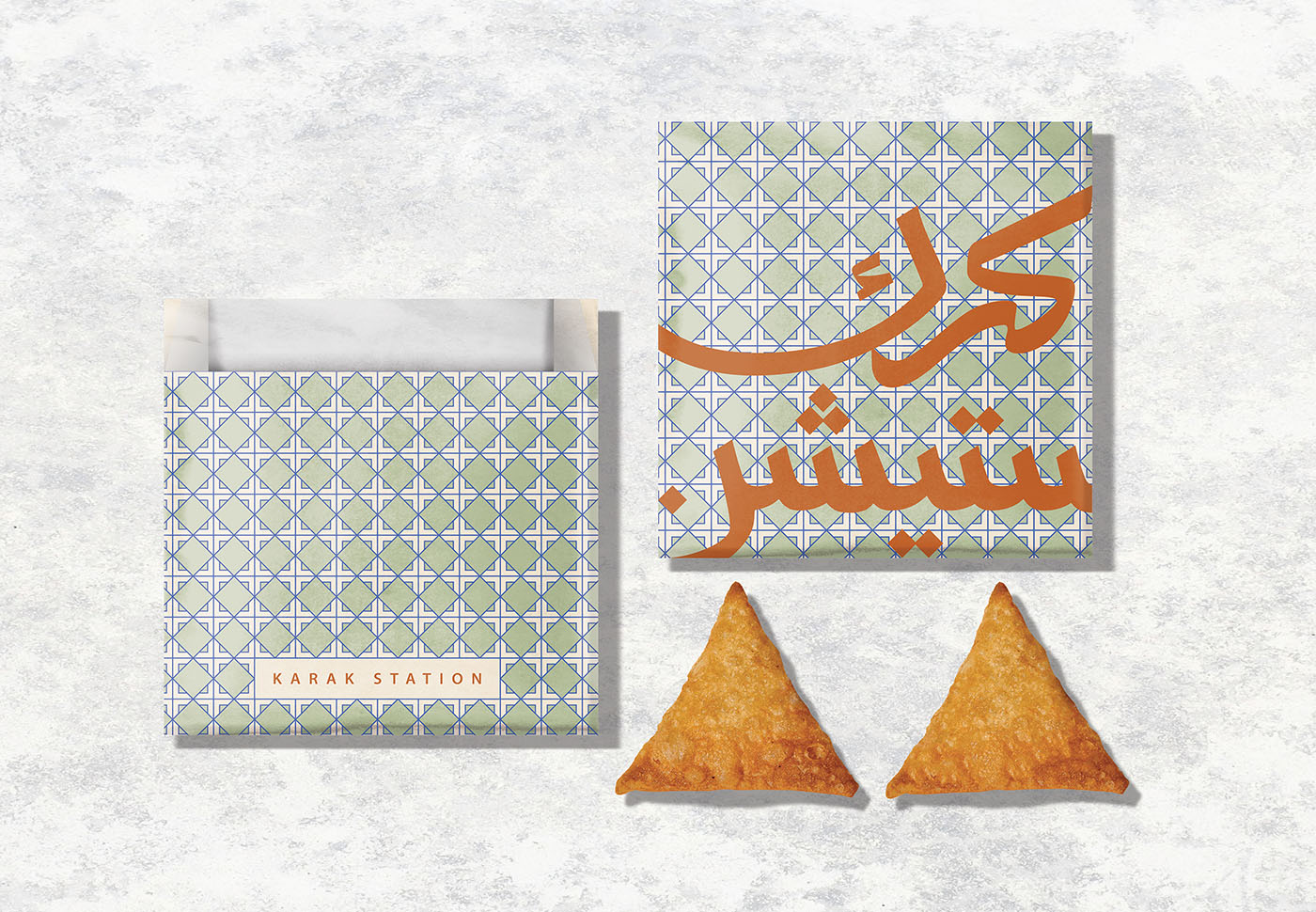
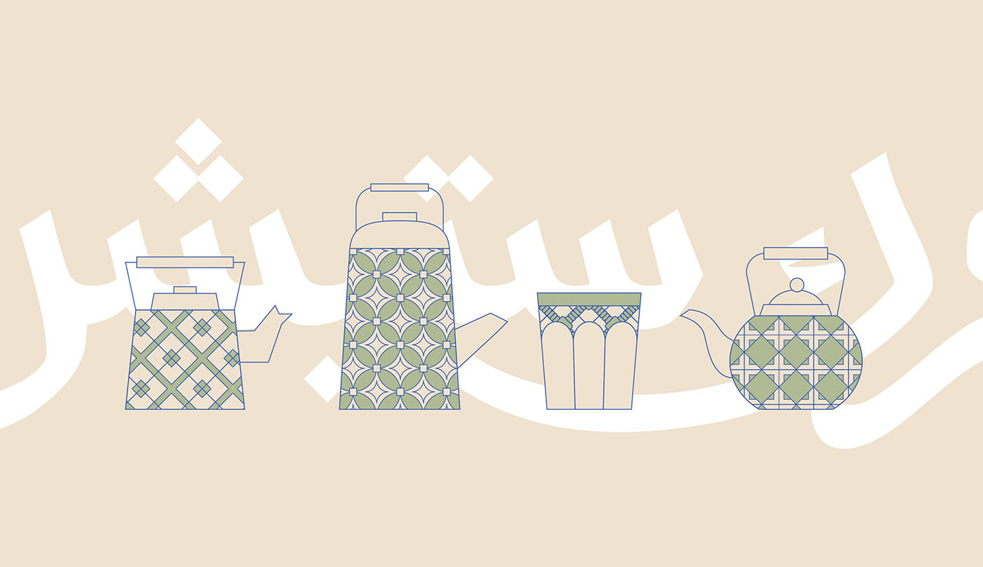
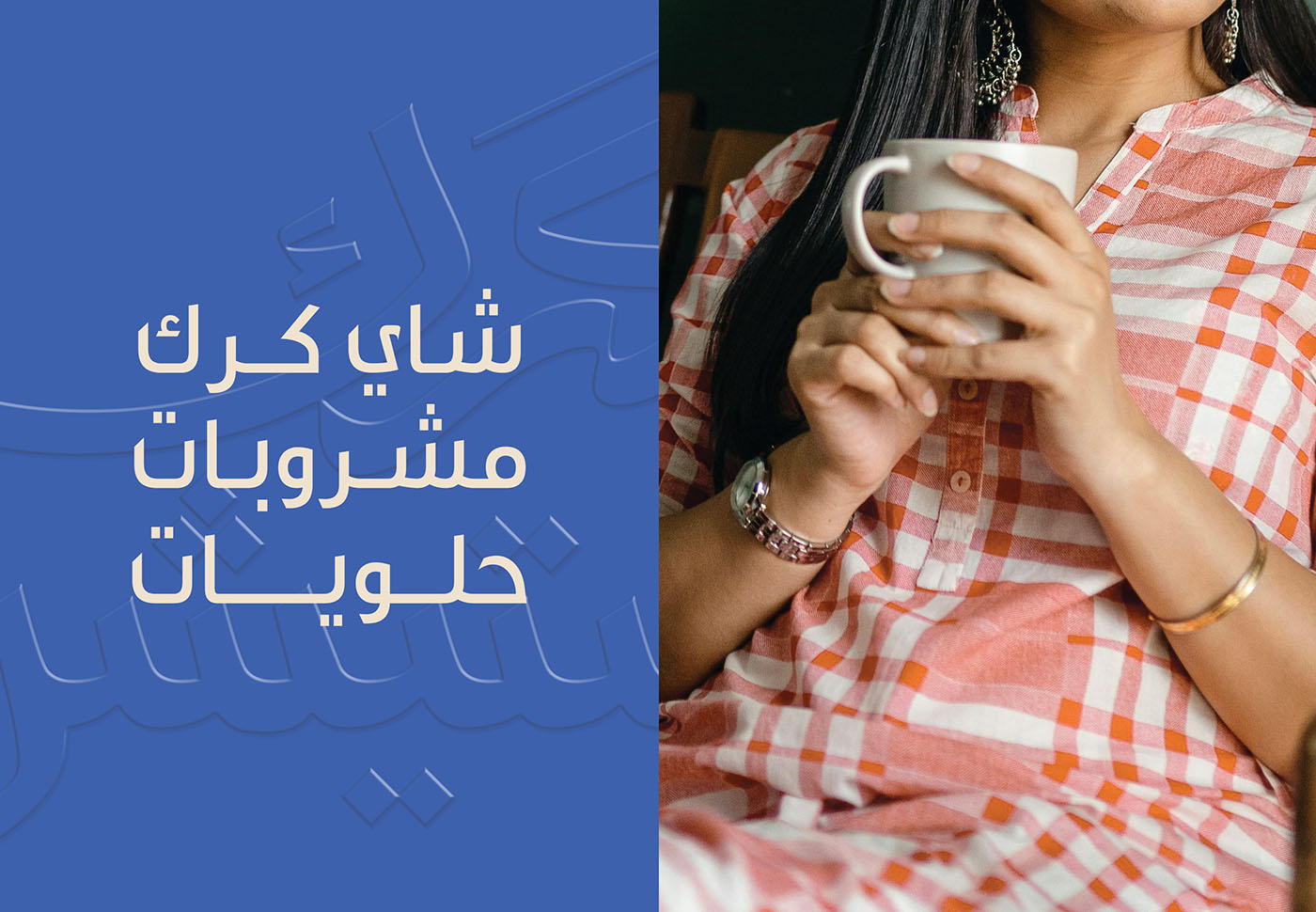
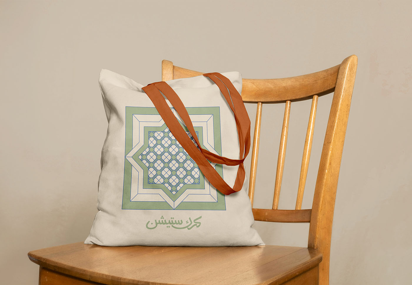
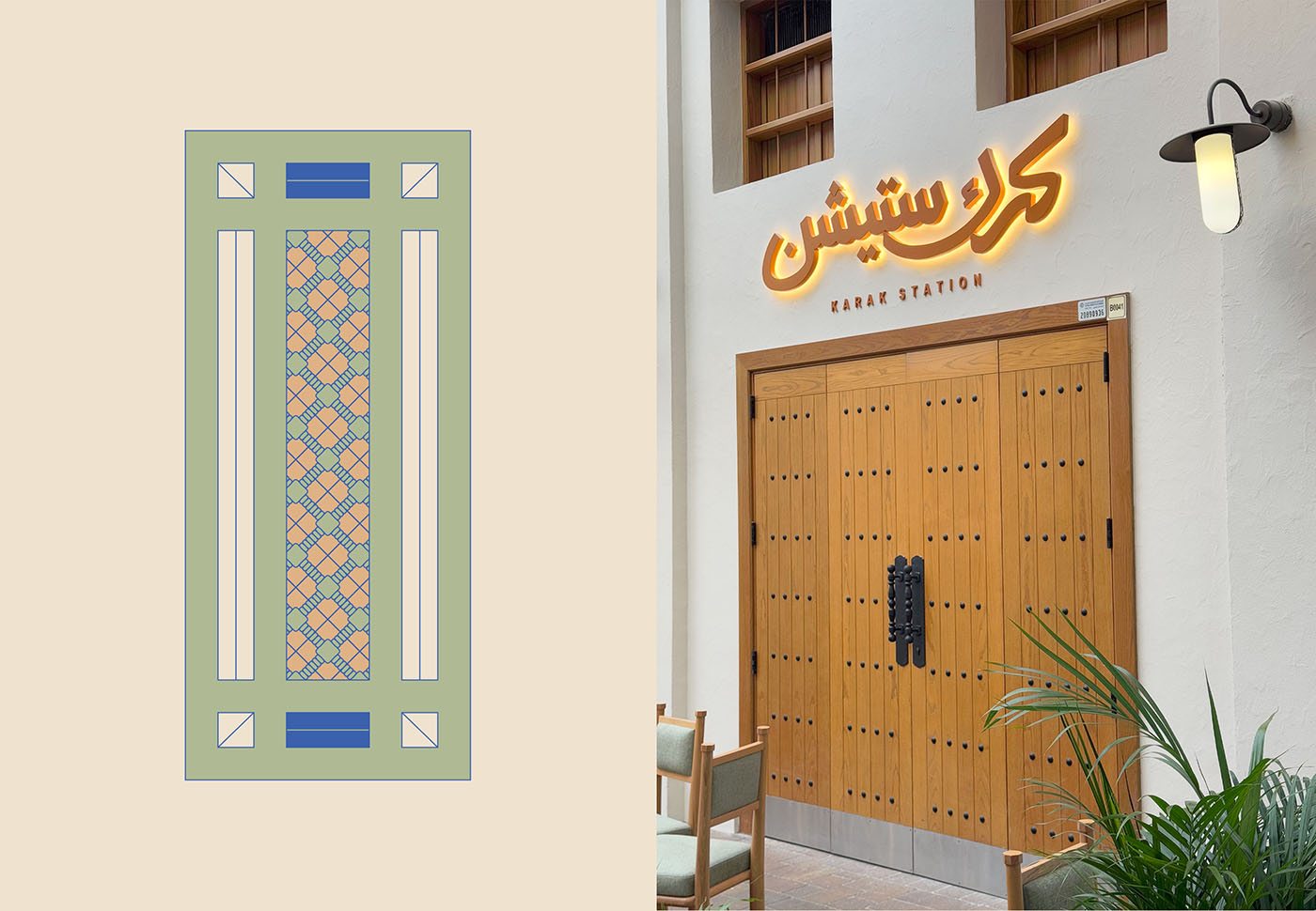
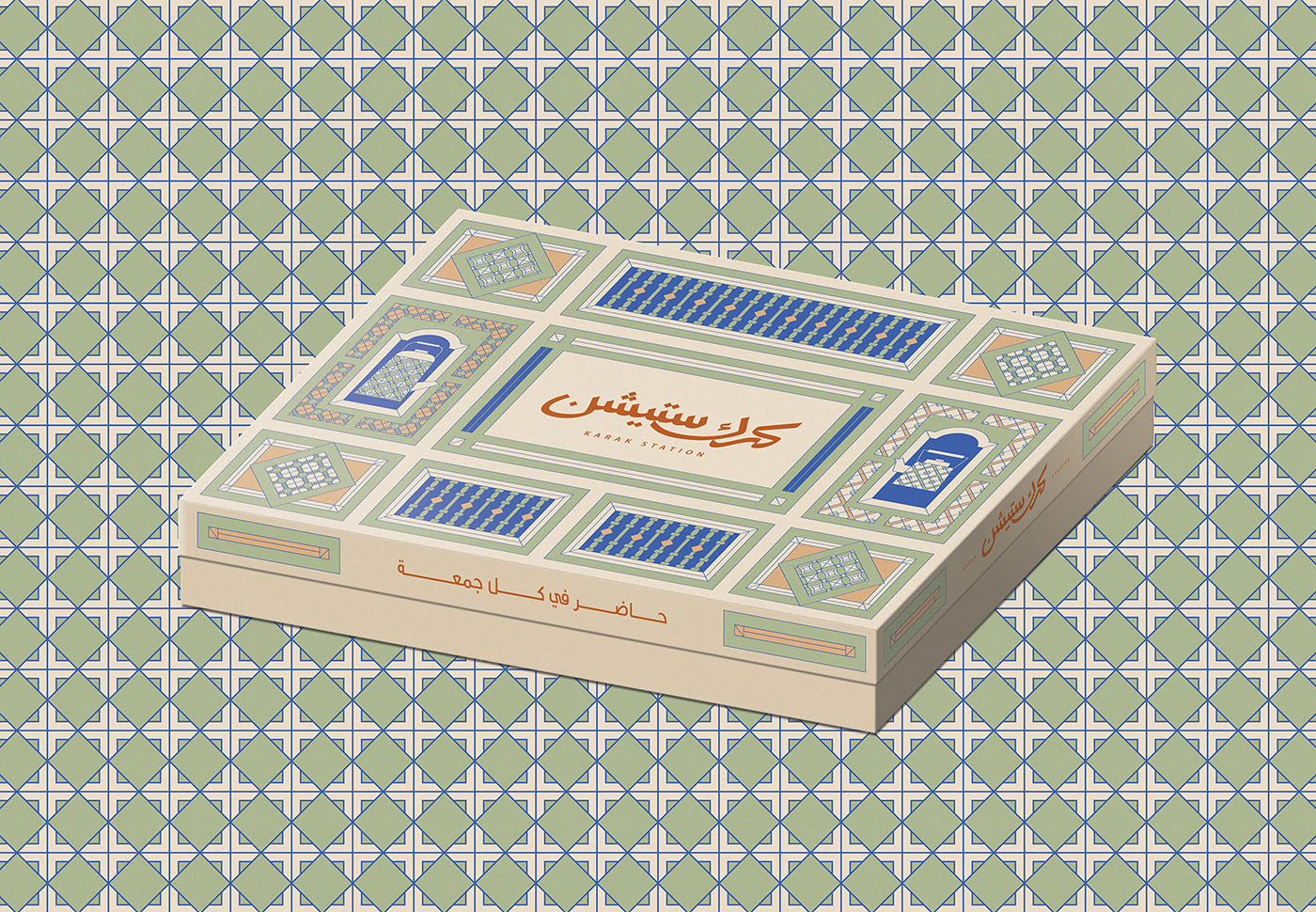
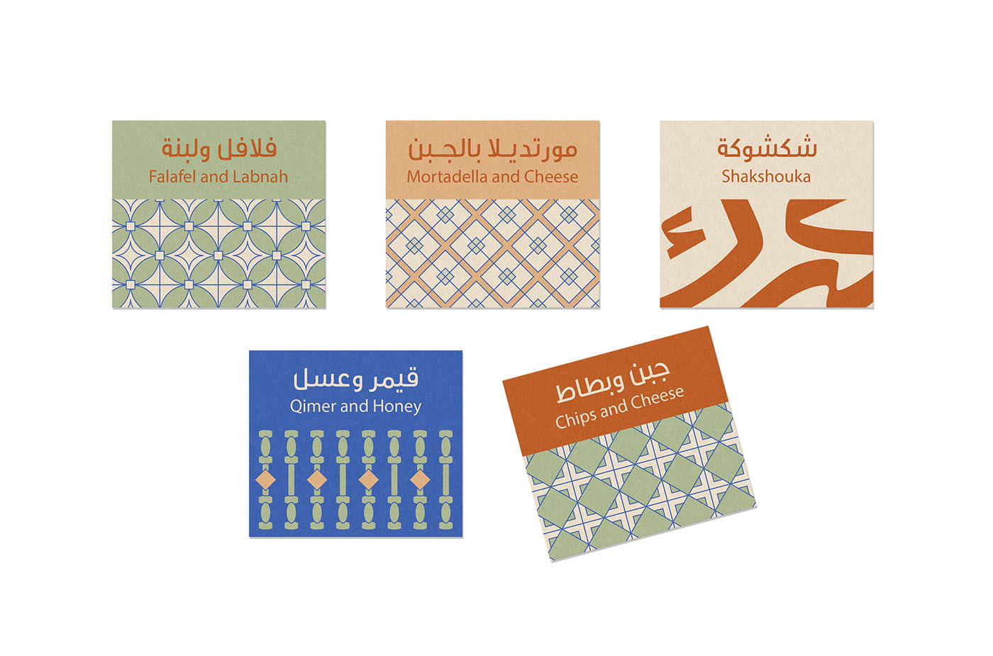
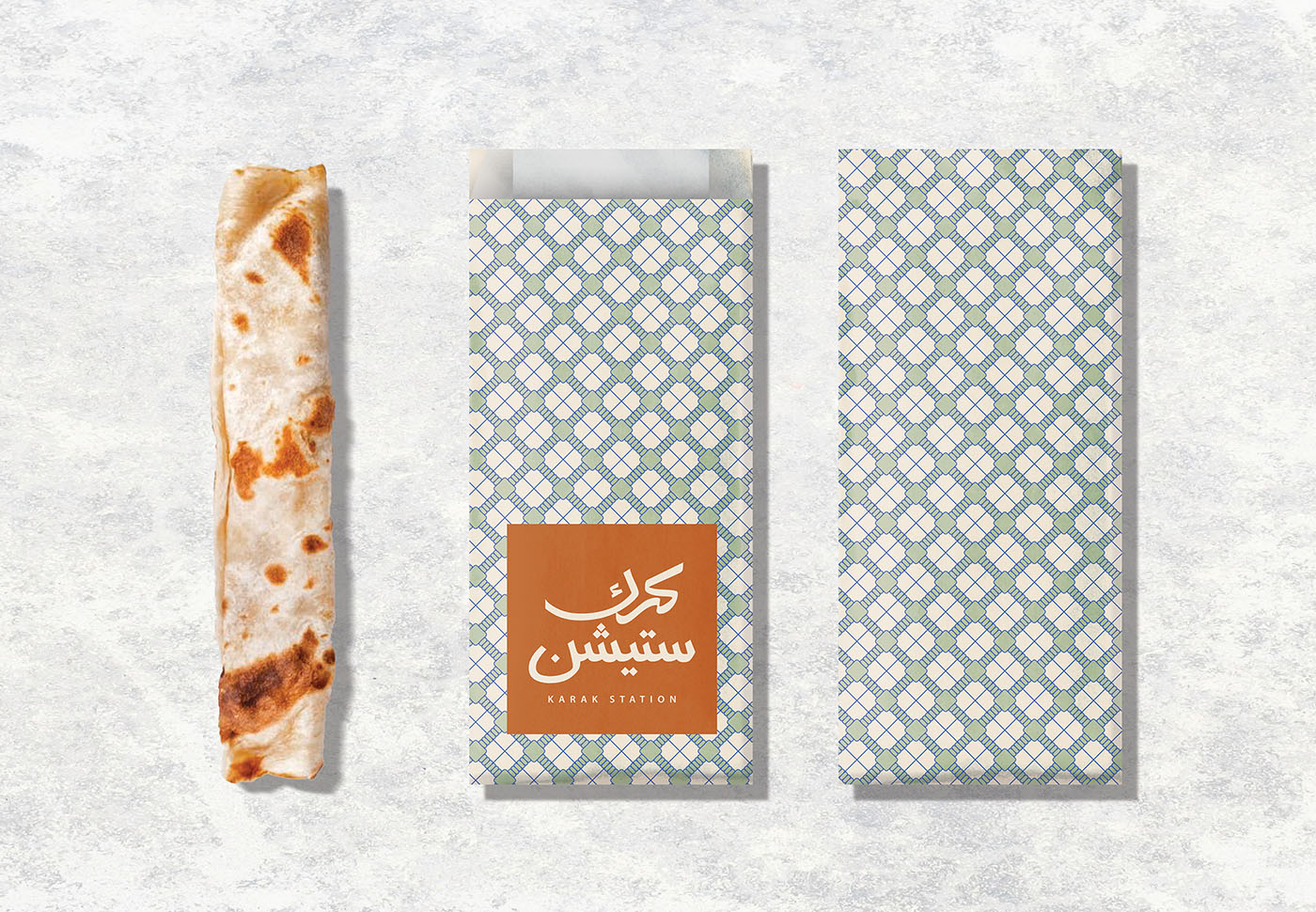
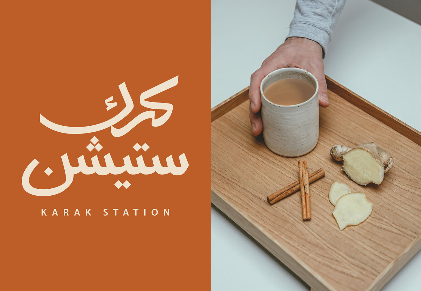
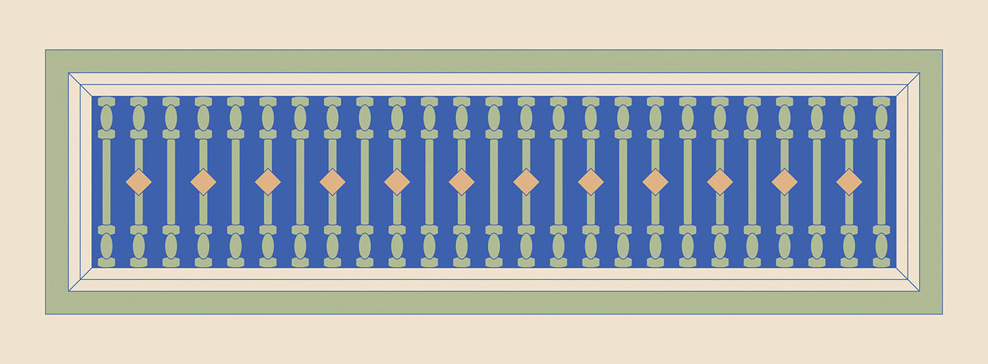
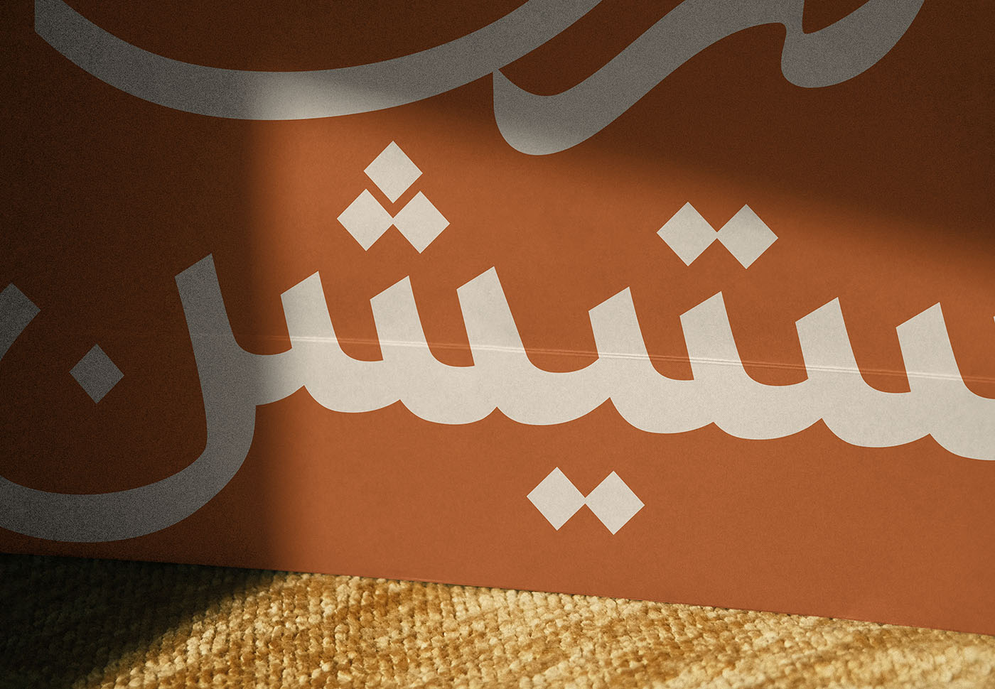
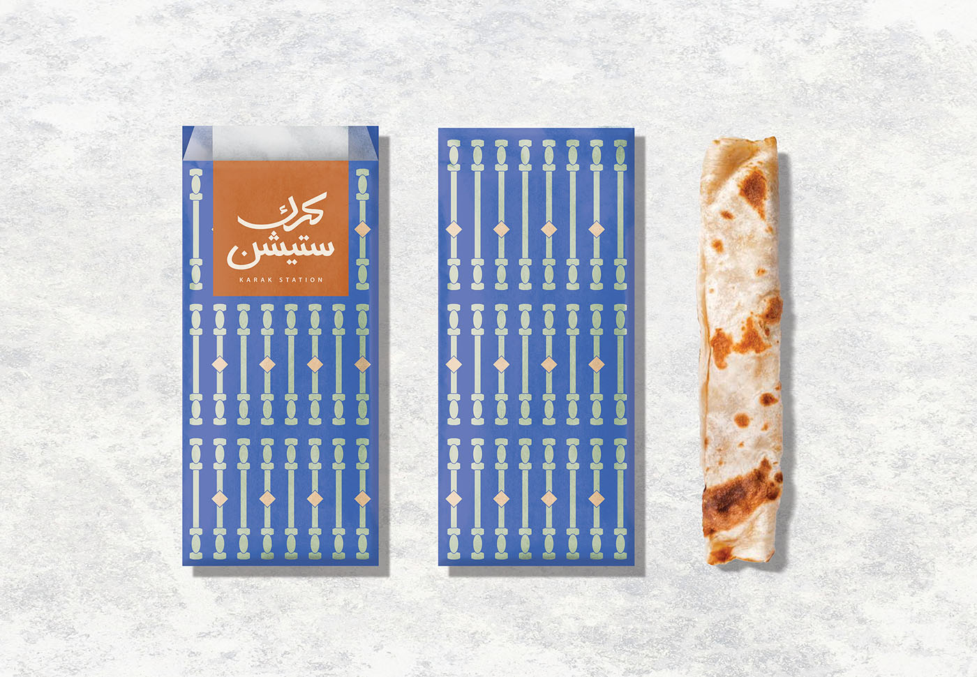
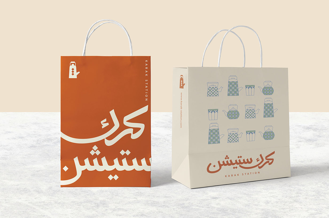
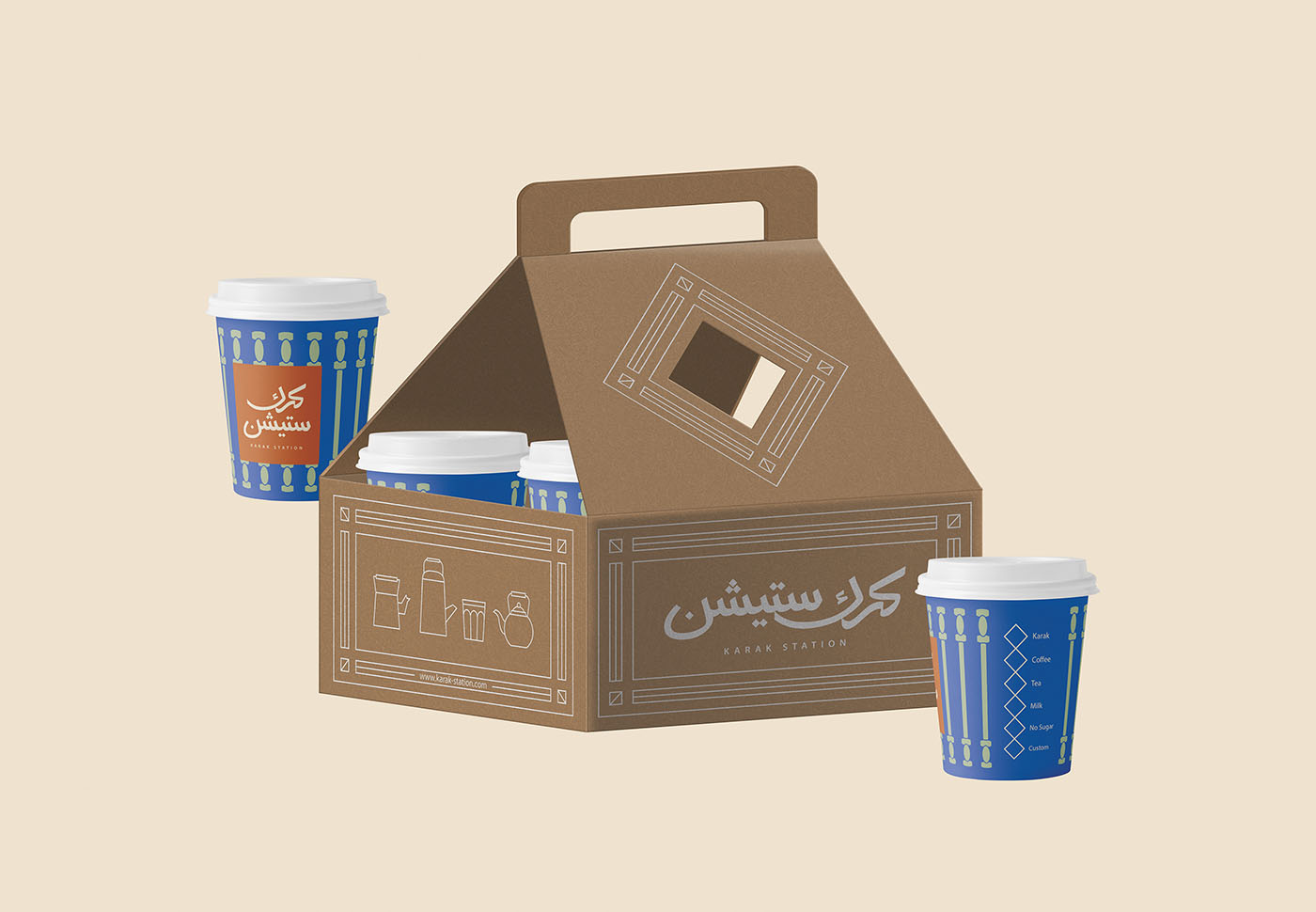
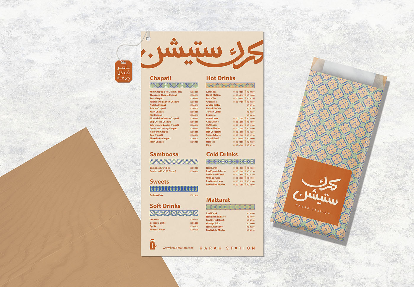
Karak Station is a brand concept deeply rooted in tradition yet presented with a fresh, contemporary spirit. Our creative direction took inspiration from the intricate beauty of Arabic patterns and the architectural elegance of "mashrabiya screens". This influence is reflected across every element of the project, from the logo and custom typography to the packaging and overall visual language. The result is a brand that feels familiar and nostalgic, yet stands out with bold structure and thoughtful detail. The soft, earthy palette paired with geometric motifs tells a story of craftsmanship, heritage, and warmth perfectly aligning with the comforting experience of a traditional Karak tea.
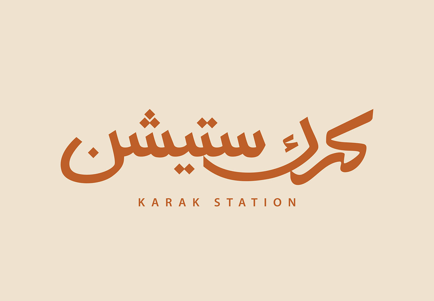
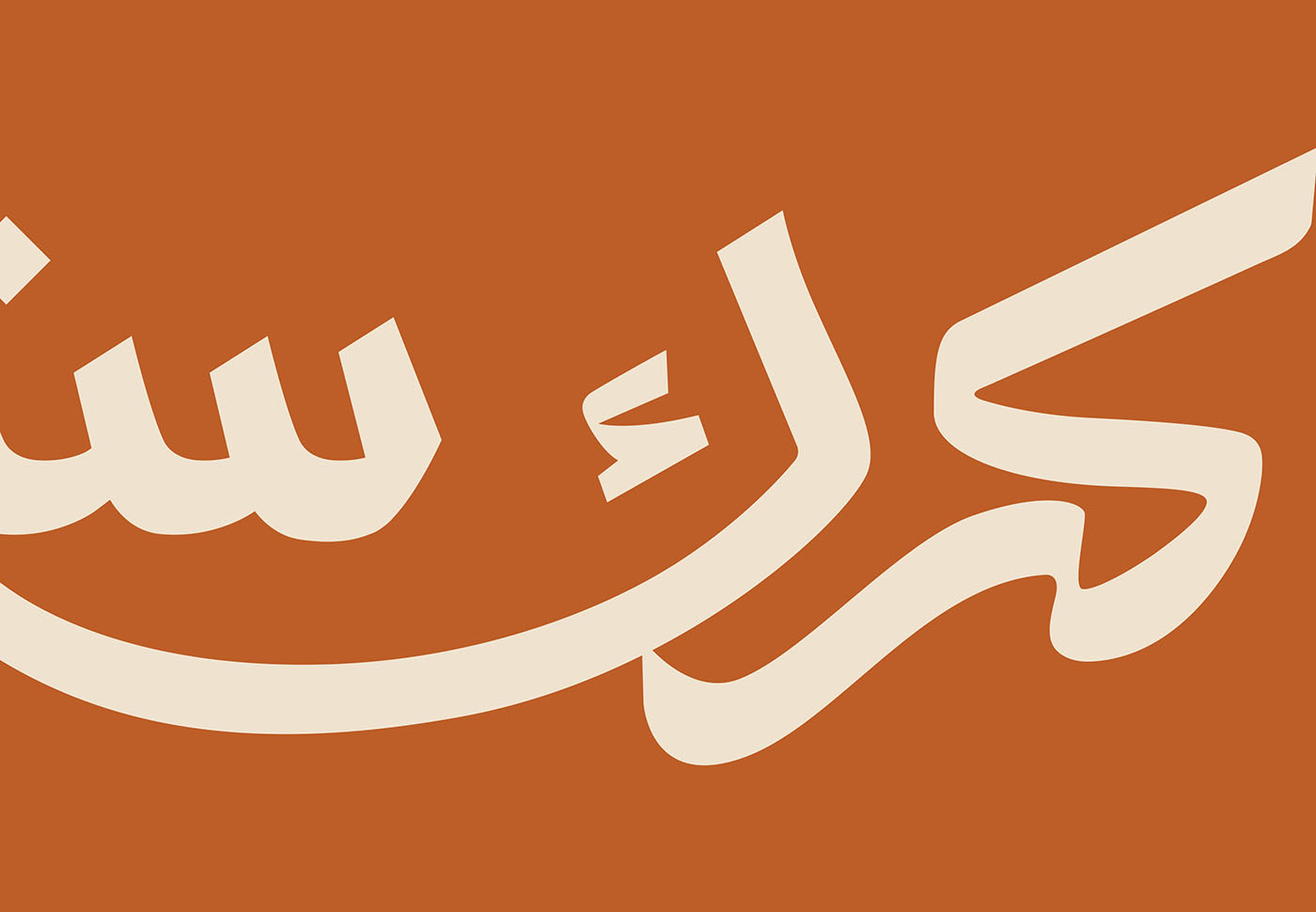
For this project, we developed a bespoke Arabic logotype that balances fluidity with precision, paired with a supporting English wordmark in a clean, understated style. We carried this visual identity through a full branding system, designing packaging that transforms into a tactile storytelling piece. Every panel and motif on the box draws from regional art and design history while remaining functional and modern. “Karak Station” became more than a name it became a destination, one expressed through design that honors the past while serving today’s aesthetic and cultural tastes.
DESCRIPTION
Karak Station is a brand concept deeply rooted in tradition yet presented with a...
Karak Station is a brand concept deeply rooted in tradition yet presented with a fresh, contemporary spirit. Our creative direction took inspiration from the intricate beauty of Arabic patterns and the architectural elegance of "mashrabiya screens". This influence is reflected across every element of the project, from the logo and custom typography to the packaging and overall visual language. The result is a brand that feels familiar and nostalgic, yet stands out with bold structure and thoughtful detail. The soft, earthy palette paired with geometric motifs tells a story of craftsmanship, heritage, and warmth perfectly aligning with the comforting experience of a traditional Karak tea.
For this project, we developed a bespoke Arabic logotype that balances fluidity with precision, paired with a supporting English wordmark in a clean, understated style. We carried this visual identity through a full branding system, designing packaging that transforms into a tactile storytelling piece. Every panel and motif on the box draws from regional art and design history while remaining functional and modern. “Karak Station” became more than a name it became a destination, one expressed through design that honors the past while serving today’s aesthetic and cultural tastes.
More..
|
SHARE PROJECT
|